Marilyne Blais Ceramics
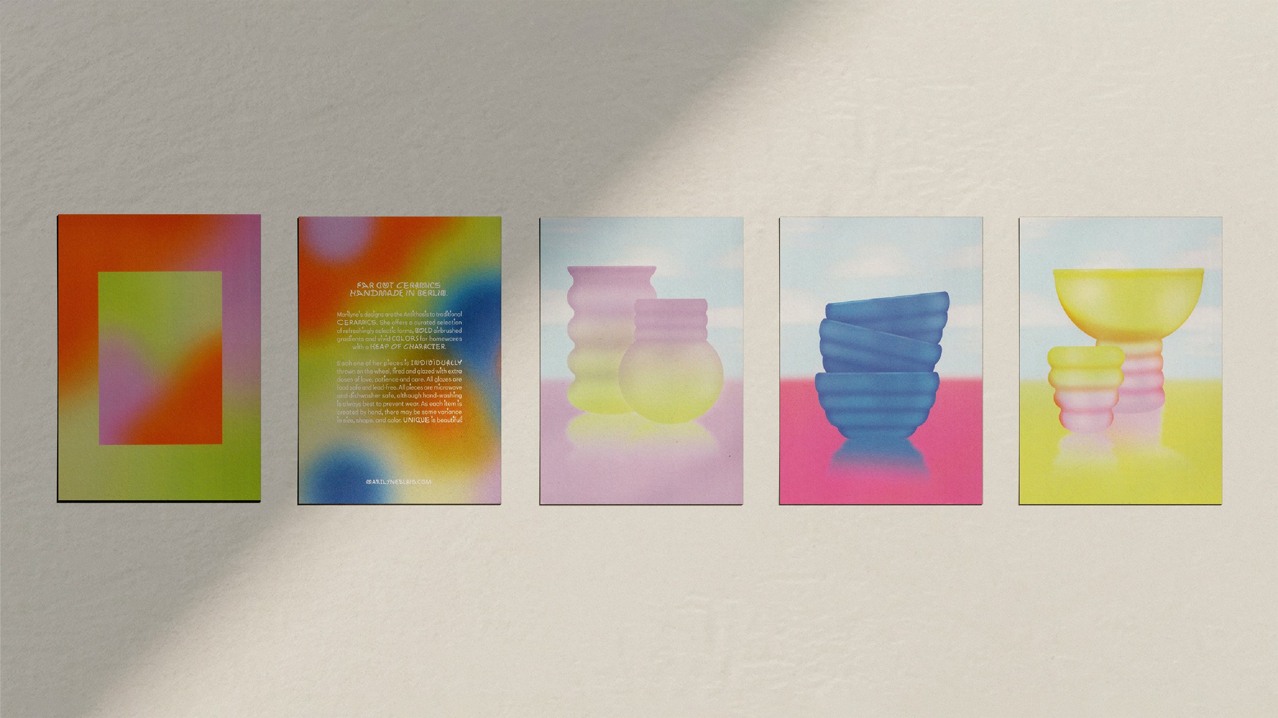
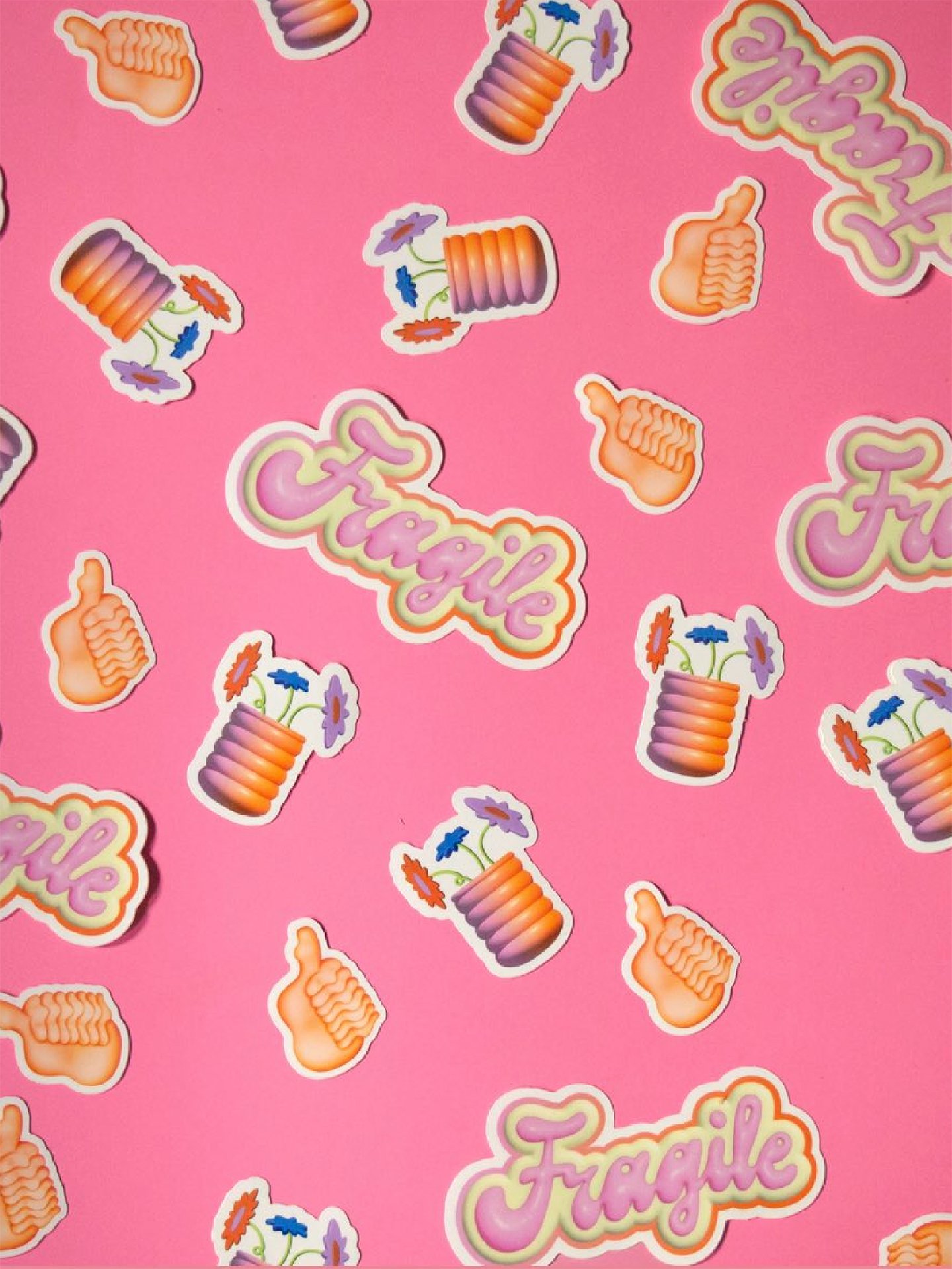
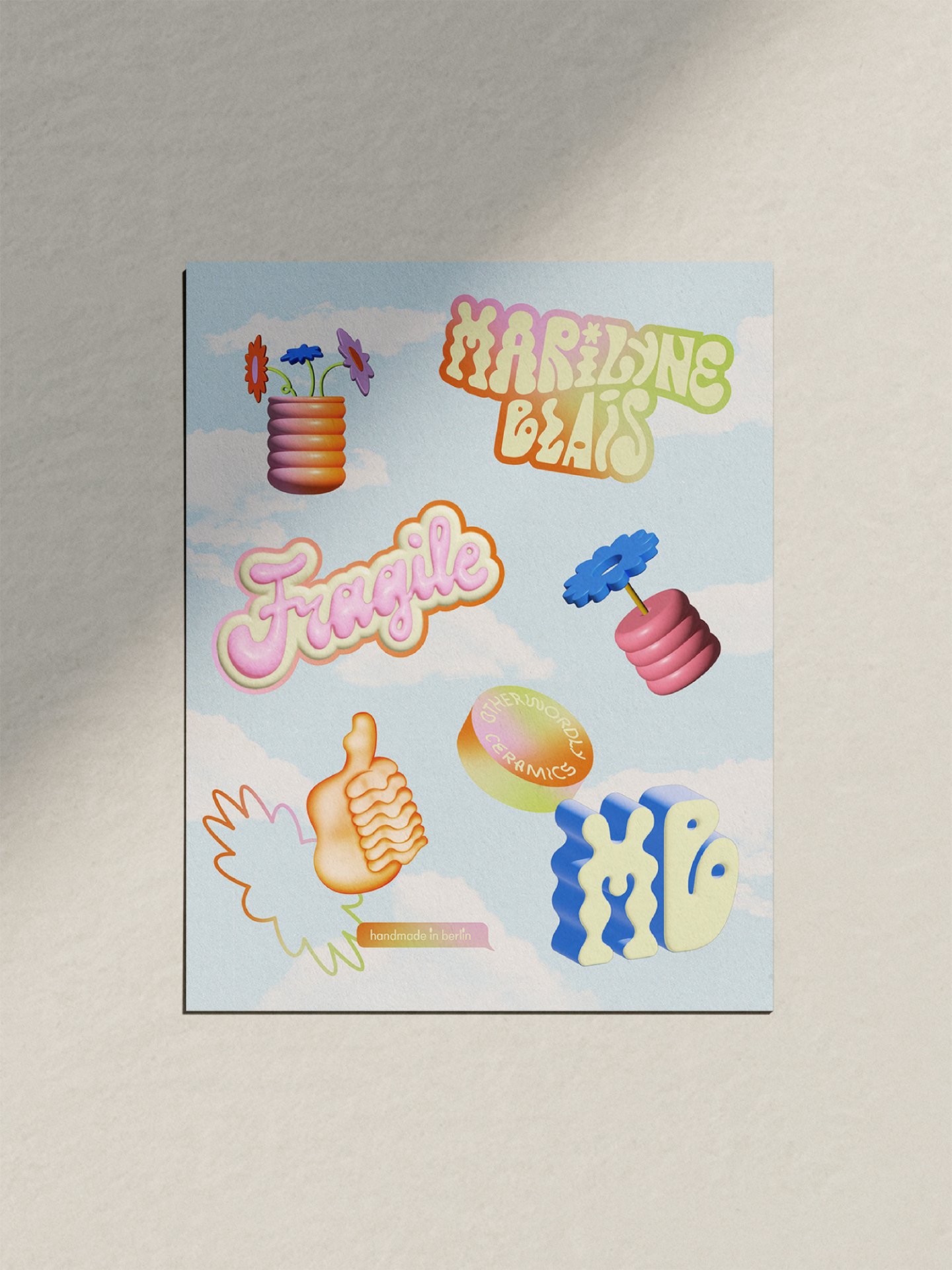
Marilyne Blais is an artist hand making far-out ceramics in Berlin, Germany. Marilyne’s designs are the antithesis to traditional ceramics. She offers a curated selection of refreshingly eclectic forms, bold airbrushed gradients and vivid colours. These three elements became the cornerstones of the new brand identity we developed together in 2022.
-
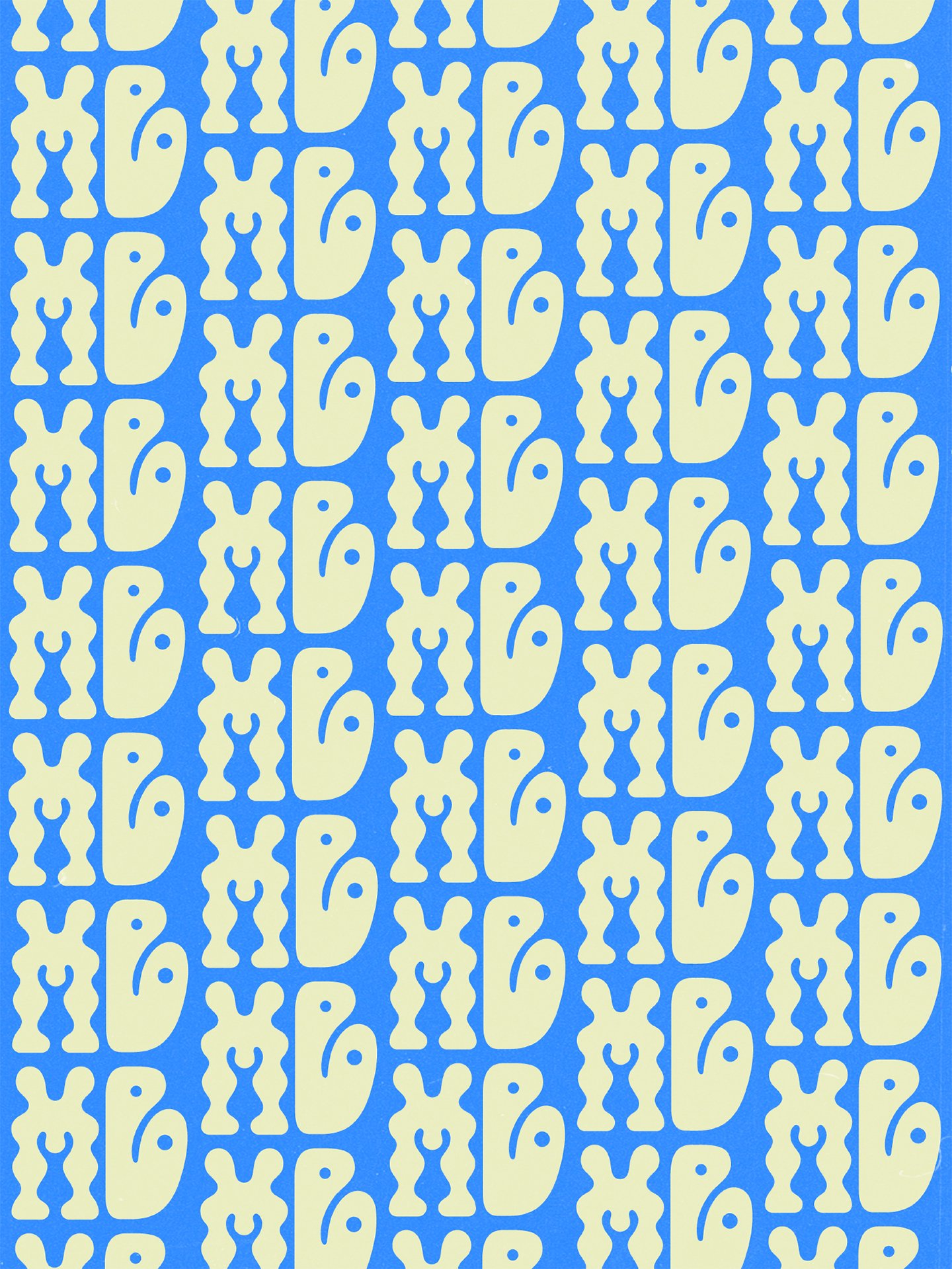
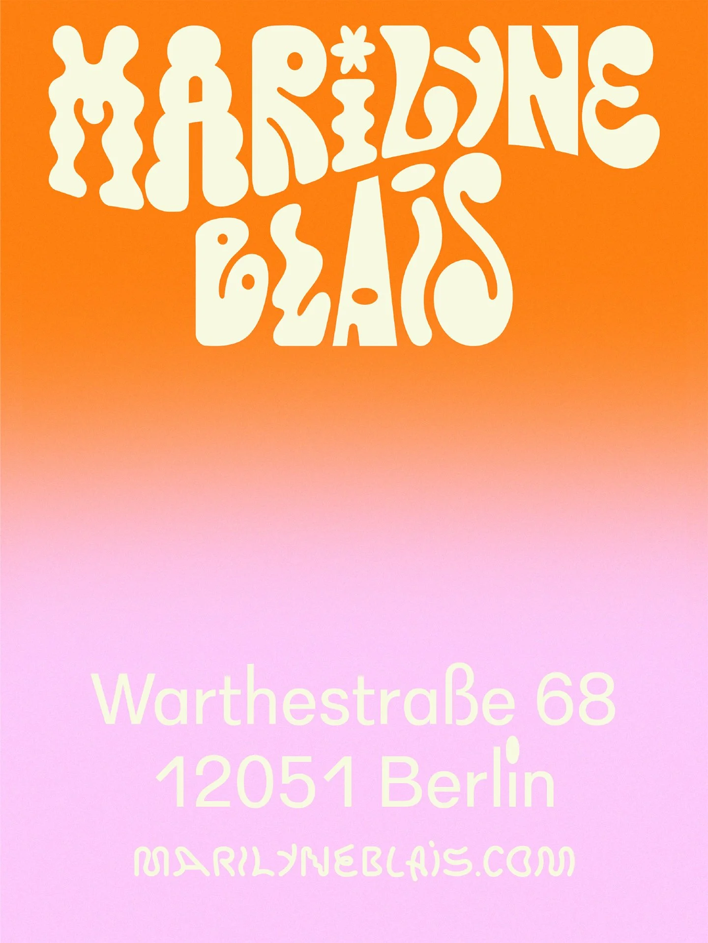
For Marilyne’s logo we created a variety of bespoke letter forms, each taking inspiration from the undulating shapes of her ceramics. The typefaces we paired this with continues the eclectic graphic forms of the logo.
We aimed to avoid black and white. Inspired by Marilyne’s ceramics bursting with colour, a vivid green-screen-green became our black, while butter yellow stands in for white. The full colour palette is extensive and rich, while still maintaining eclectic cohesion.
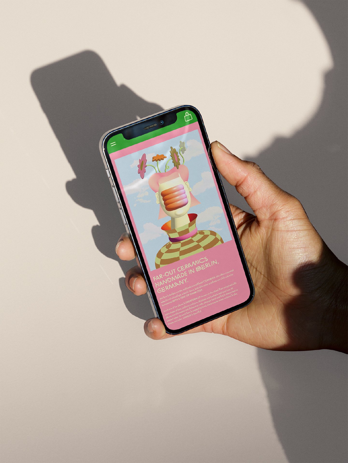
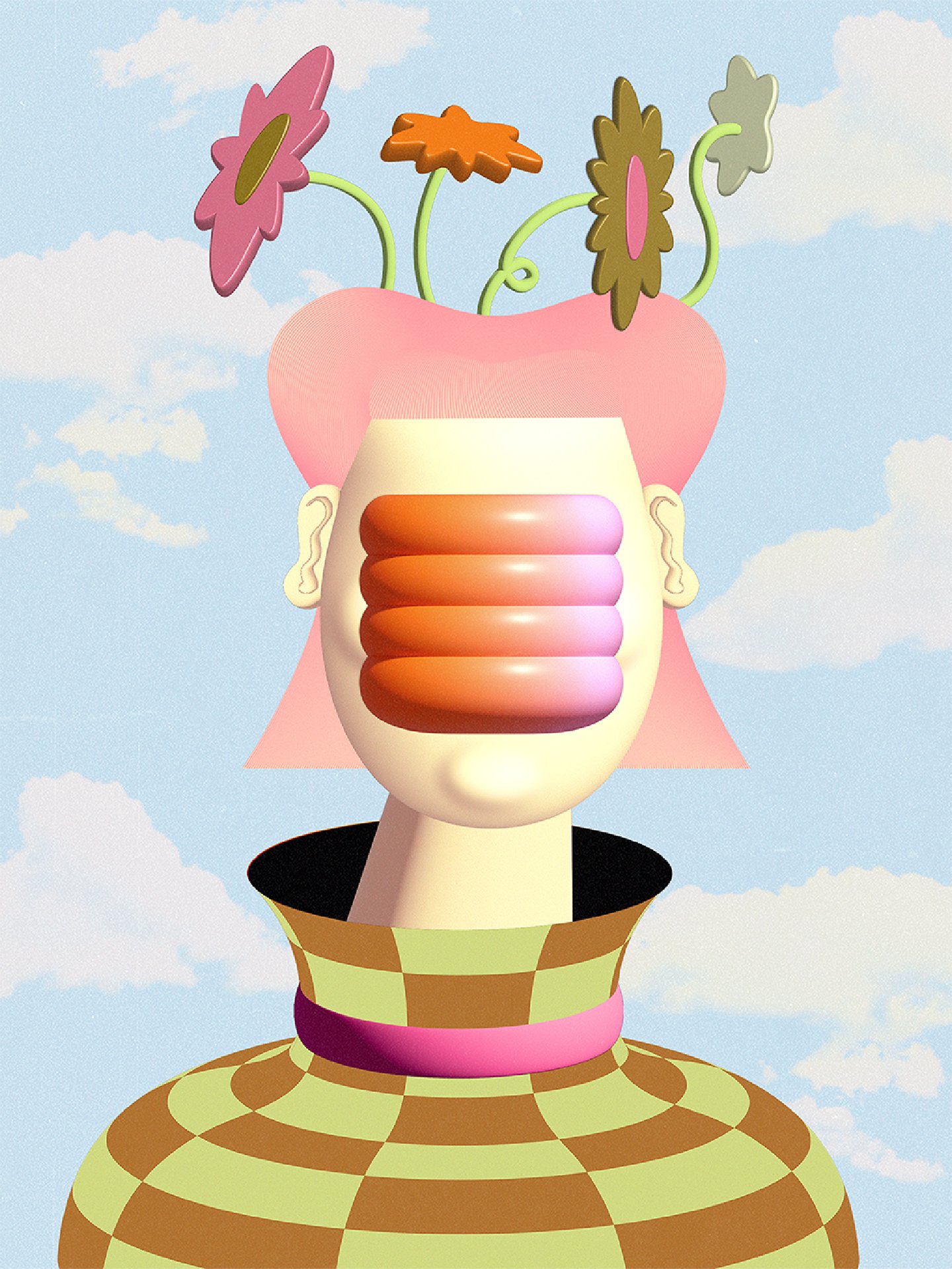
In bringing Marilyne Blais’s world to life, an otherworldly illustrated identity emerged, combining 2D and 3D graphics, and airbrushing. The collection pulls inspiration from 60s psychedelia, 80s post-Modernism and early internet culture. In addition, we made a modular graphics system with an extensive library of assets (gradients, shapes, ready-to-use graphics) for endless combinations of imagery.
For Marilyne’s logo we created a variety of bespoke letter forms, each taking inspiration from the undulating shapes of her ceramics. The typefaces we paired this with continues the eclectic graphic forms of the logo.
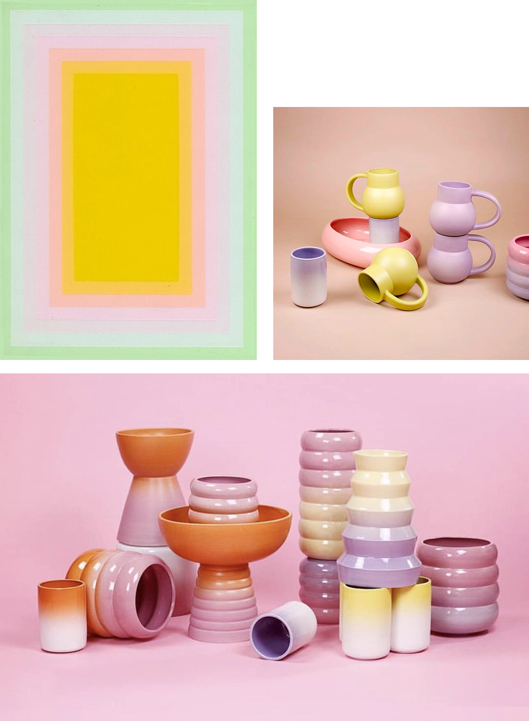
(Top Left) Untitled Serigraph by Richard Anuskiewicz, c. 1960s, (Top Right) Marilyne Blais (Bottom) Marilyne Blais
We went beyond the ordinary world. Inspired by ceramics bursting with colour, a vivid green-screen-green became our black, while butter yellow stands in for white. The full colour palette is extensive and rich, while still maintaining eclectic cohesion.
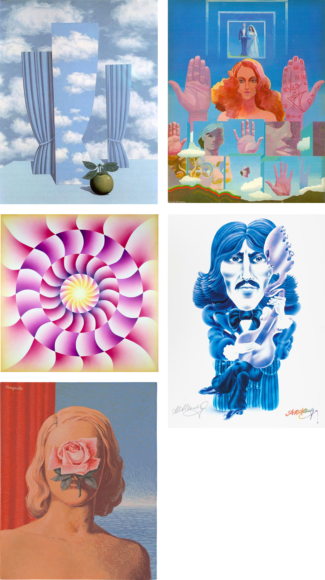
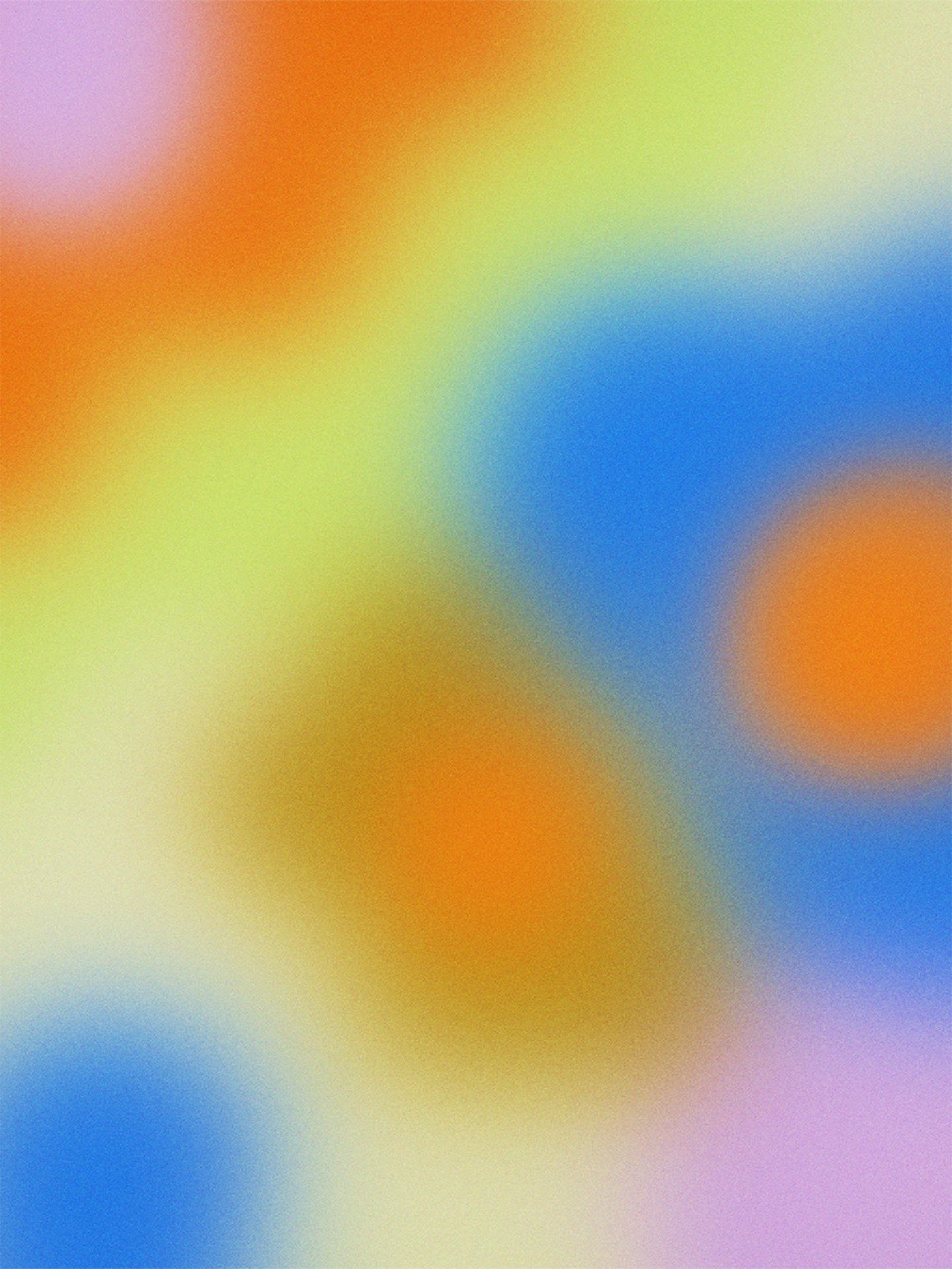
Inspired by surrealism’s use of layering, the identity plays with multiple ideas living within a single image to build a world. References to post-psychedelic illustration of the late 60s and 70s–where symbolism and collage-like thinking shaped visual storytelling–helped form a language grounded in Marilyne’s own eclectic references. Gradients play a key role in her work, leading naturally to airbrushed illustrations and forms inspired by Alan Aldridge and Judy Chicago.
Together, these inspiration points led us to bring Marilyne Blais’s world to life through an otherworldly illustrated identity combining 2D and 3D graphics. The system pulls from 60s psychedelia, 80s post-modernism, and early internet culture, and is supported by a modular graphics toolkit with an extensive library of assets–gradients, shapes, and ready-to-use elements–designed for endless variation.
(Top Left) Le beau monde (High Society) by René Magritte, 1962 (Top Right) Read His Palm by Wilson McLean, 1970 (Centre Left) Let It All Hang Out by Judy Chicago, 1973 (Centre Right) George Harisson by Alan Aldridge c. 1960s (Bottom Left) René Magritte for the June cover of the French art publication XXe Siècle, 1965.
From the seeds of our initial logo sketches, Blais Bold was born—an expressive typeface that brings bold personality to the brand. Channeling the unmistakable flair of Milton Glaser’s 80s post-modernist lettering, Blais Bold gives us room to play, adding versatility to the brand's visual language. It’s a nod to Marilyne’s inspiration, yet built for contemporary expression, expanding the possibilities of how the identity comes to life.
“I had a great experience working with Emma. I thought she was very hands-on and clear. During the whole creative process, I felt really implicated and she constantly checked with me. I also felt like she was able to follow my creative brief while also bringing her own inputs and her point of view to the project. Overall it felt very collaborative and things turned up better than I ever expected. In my case, I really like how personal the process felt and how enthusiastic Emma was about the work, It really felt like it was more of a creative project and not just a business deal. I’m excited for more animation work coming from the studio. And hoping to come back for more projects in the future. What would I say to someone who’s considering working with Doing Me Doing You? Do it.”
– Marilyne Blais, Ceramicist & Founder
Berlin, Germany
PRODUCT PHOTOGRAPHY
Marilyne Blais
PROJECT PHOTOGRAPHY
Anne Freitag
Emma Hursey
3D RENDERS
Joli B
TYPEFACES
Zig Zag
Elastik
Times Dot
2022, 2024


