Dare To Be Curious with Kindred People
⭐ Gold Winner in Packaging Design for Graphic Design
⭐ Gold Winner in Branding for Graphic Design
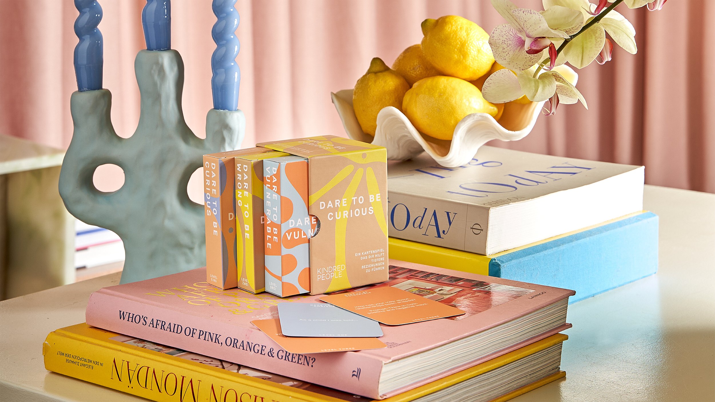
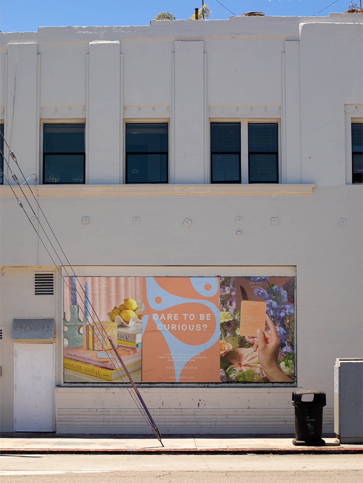
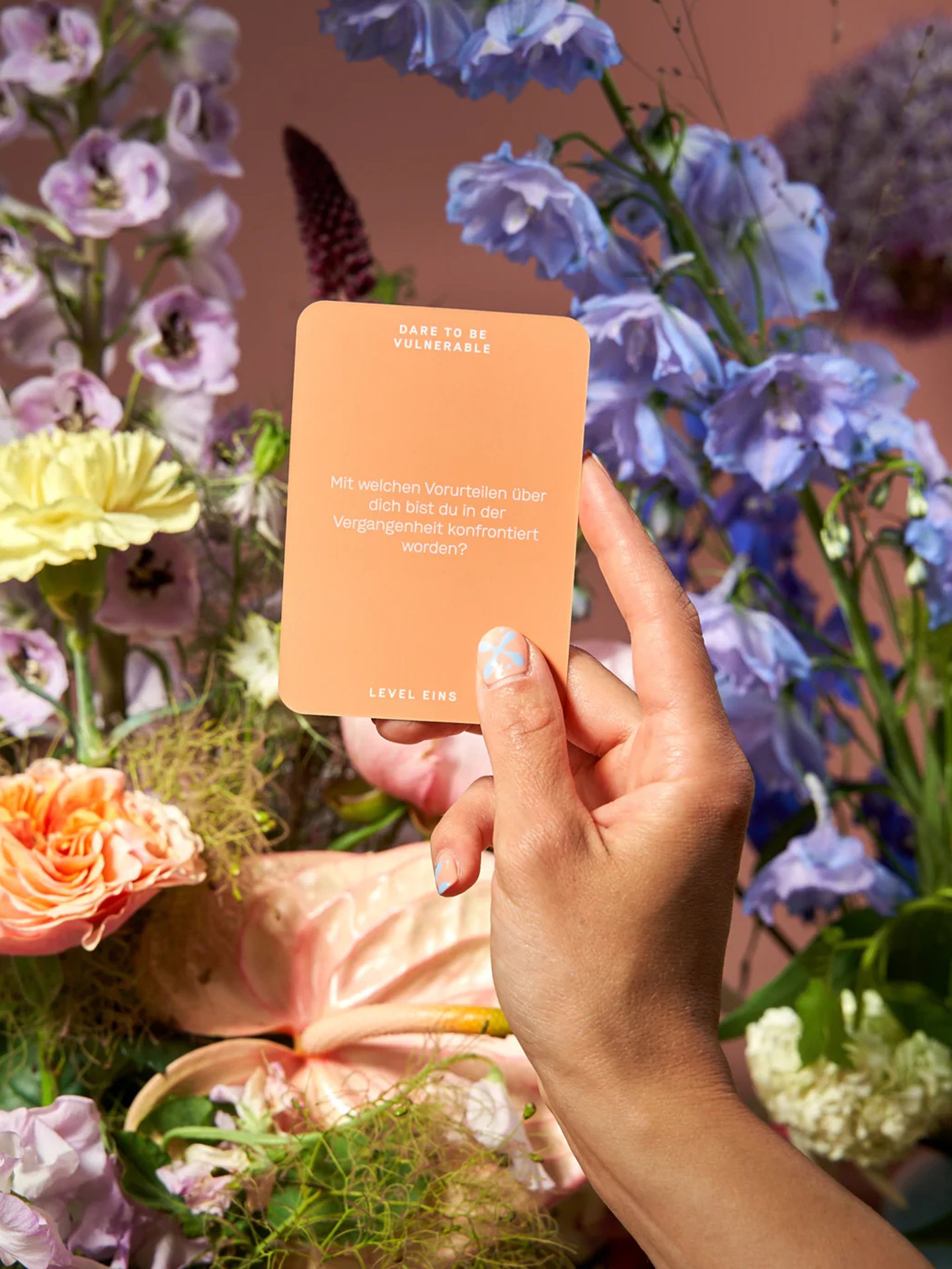
Kindred People is a lifestyle brand making conversation card games. Their first game – Dare To Be Curious – is designed to facilitate deep, meaningful conversations between friends, acquaintances and strangers alike. Through a series of thought-provoking questions, the players get to know one another – and themselves – better. Our branding and packaging for Kindred People won gold at Indigo Design Awards 2023.
-
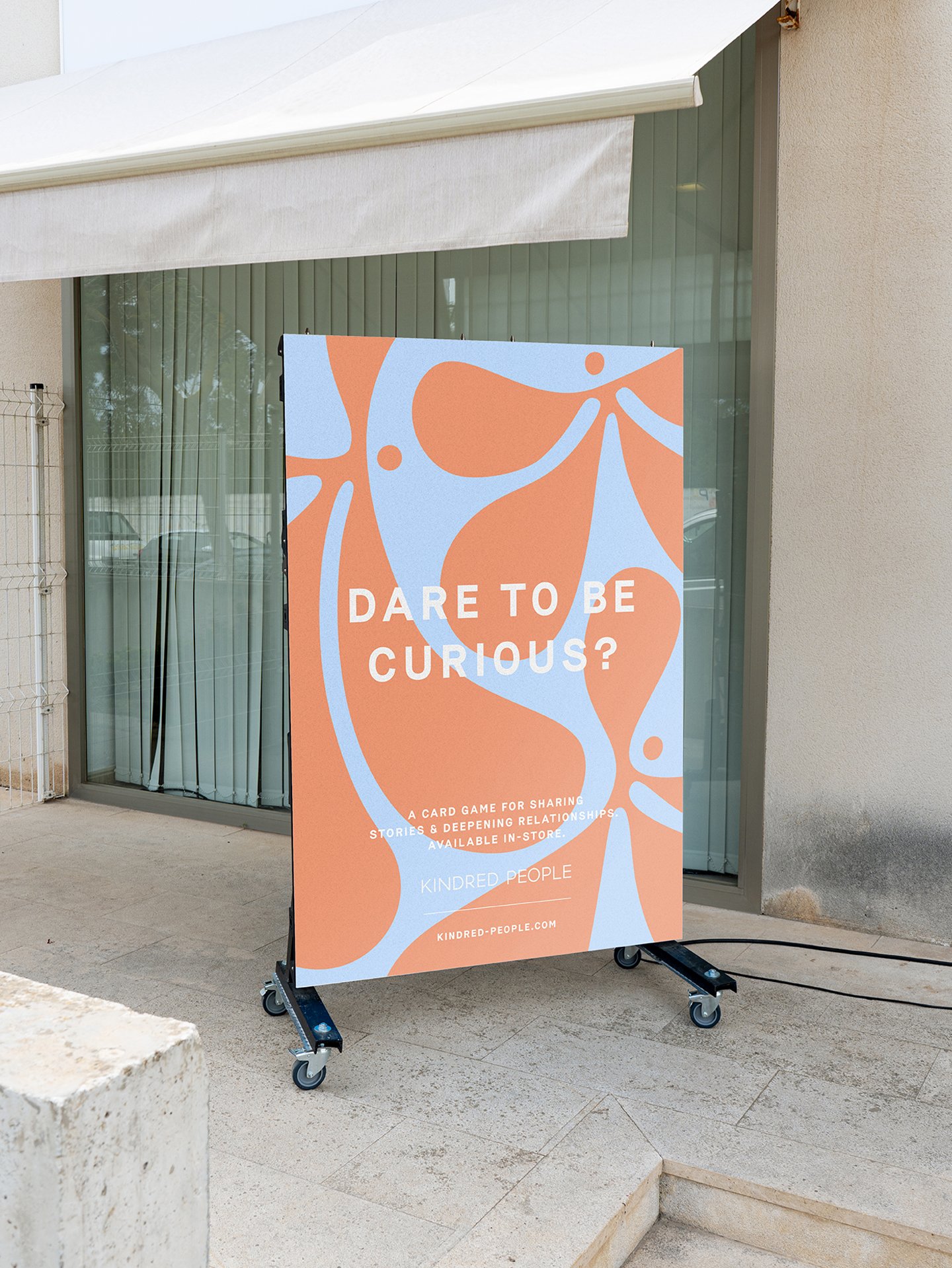
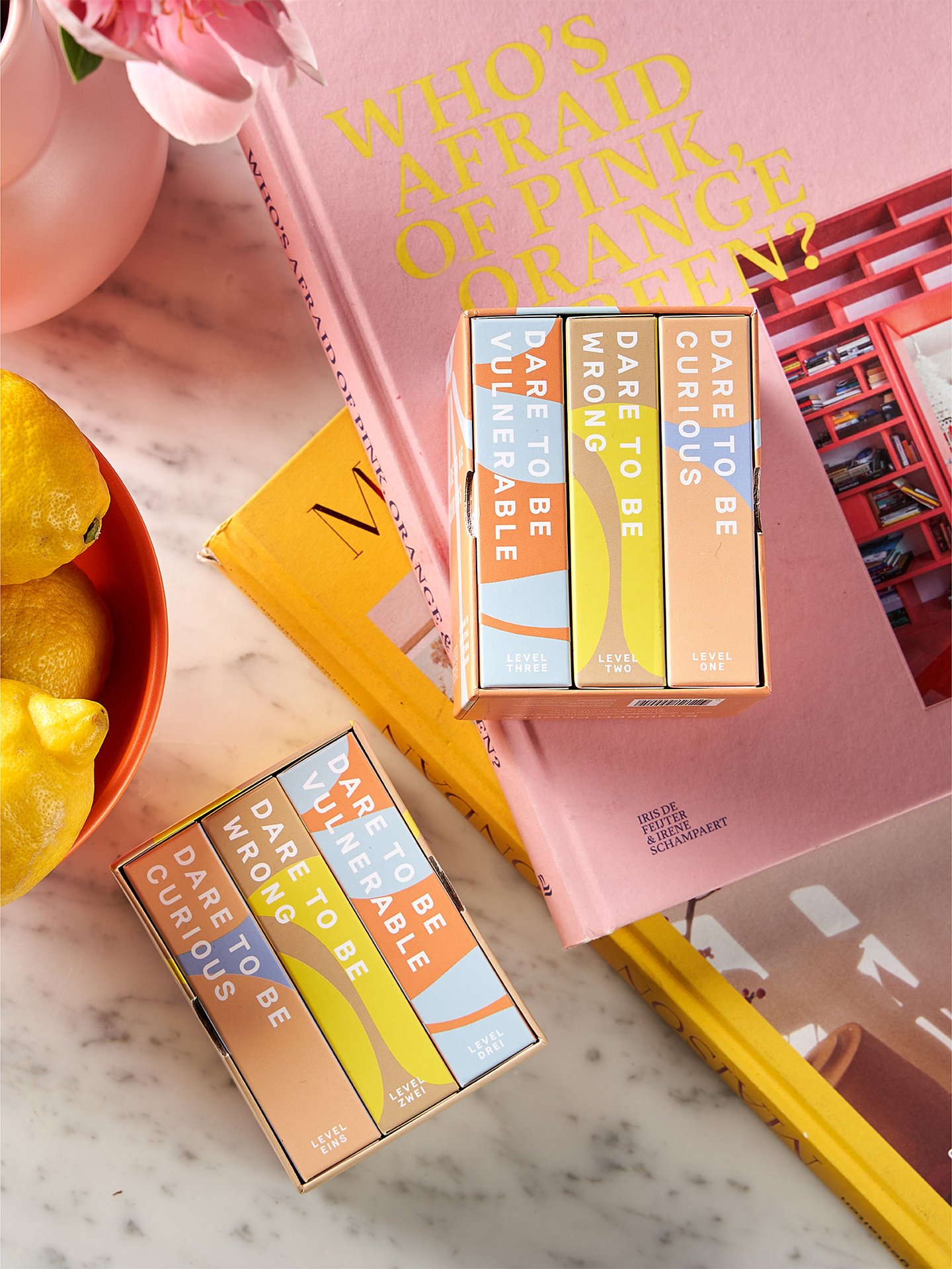
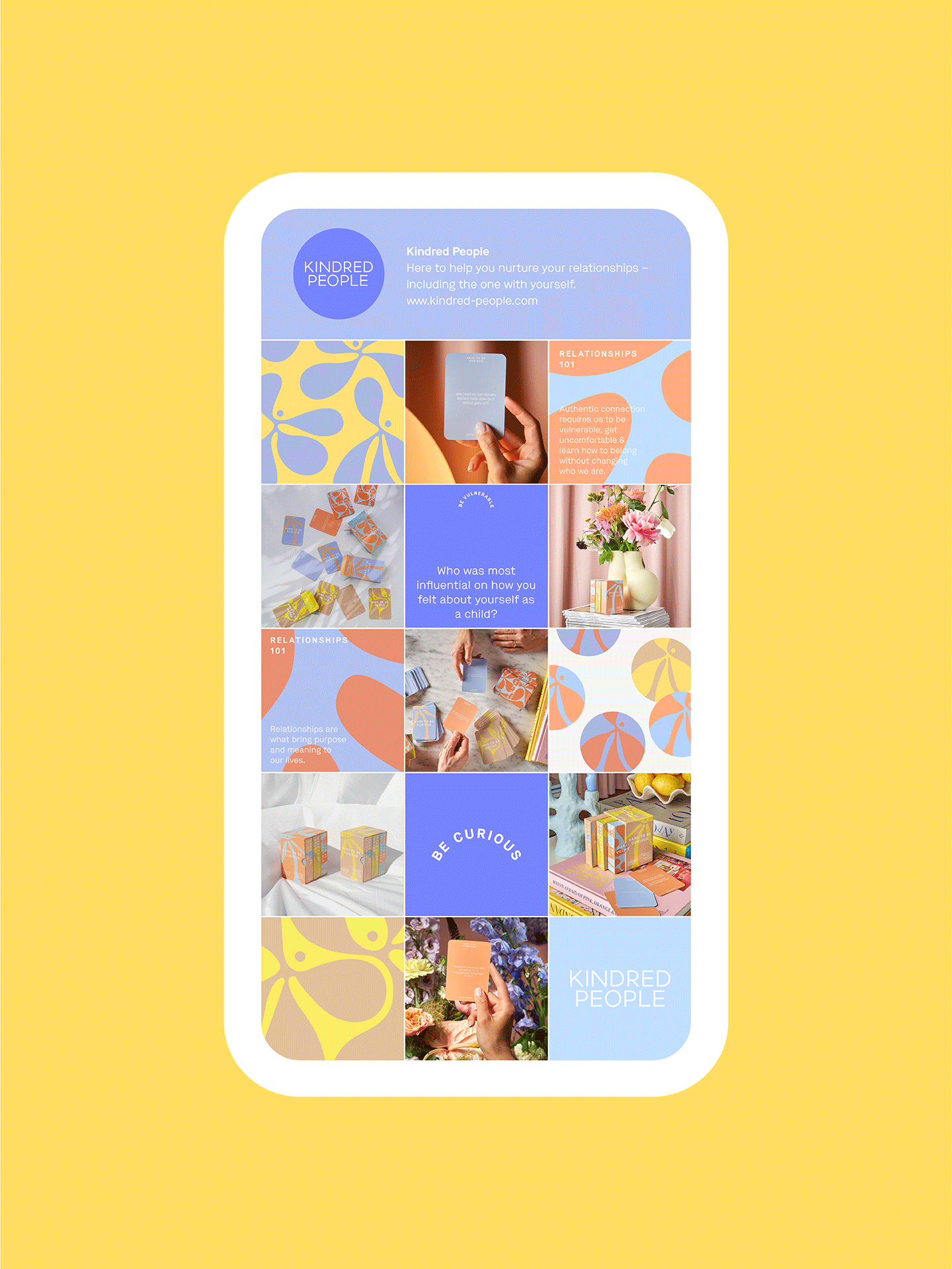
The soft, comforting colour palette has heaps of shelf appeal and recognition — addressing one of Kindred People’s core goals. The colour palette is comprised of unexpected combinations of pastels and contradictory bolder tones. We developed varying colour combinations for distinct editions, including the German and English language versions.
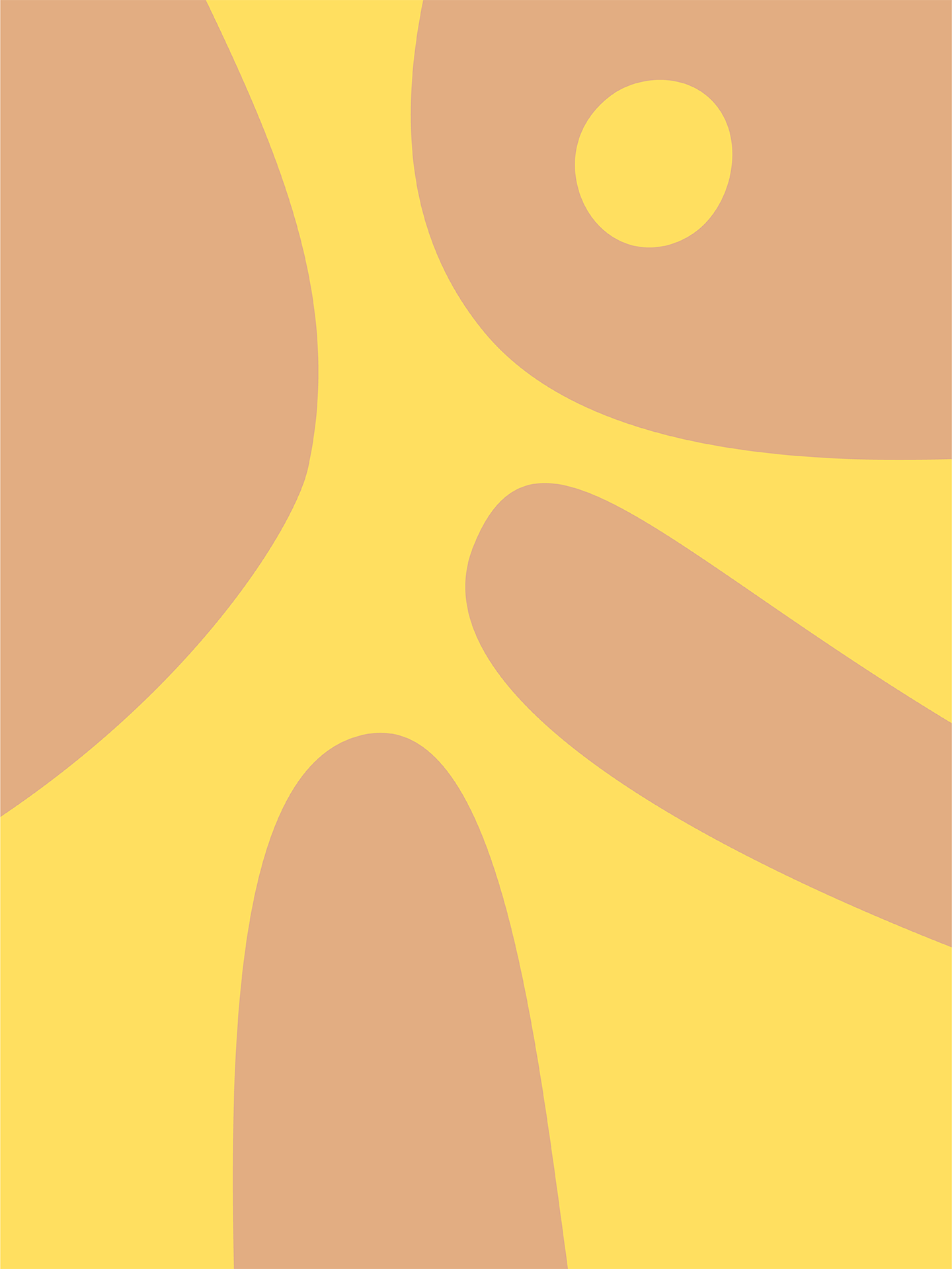
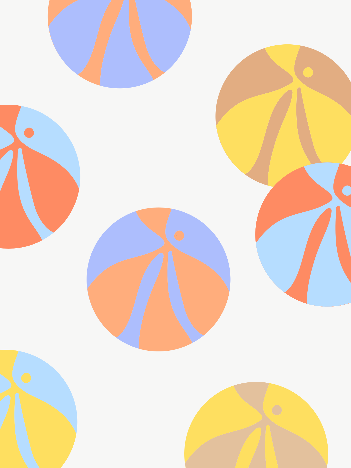
We kicked off Kindred People’s identity design through the Dare To Be Curious game and packaging. This is coffee table-worthy box set is small and transportable, ready for conversations anywhere. The series of fluid human forms we created expressed vulnerability and change, inspired by sensations of this conversational game.
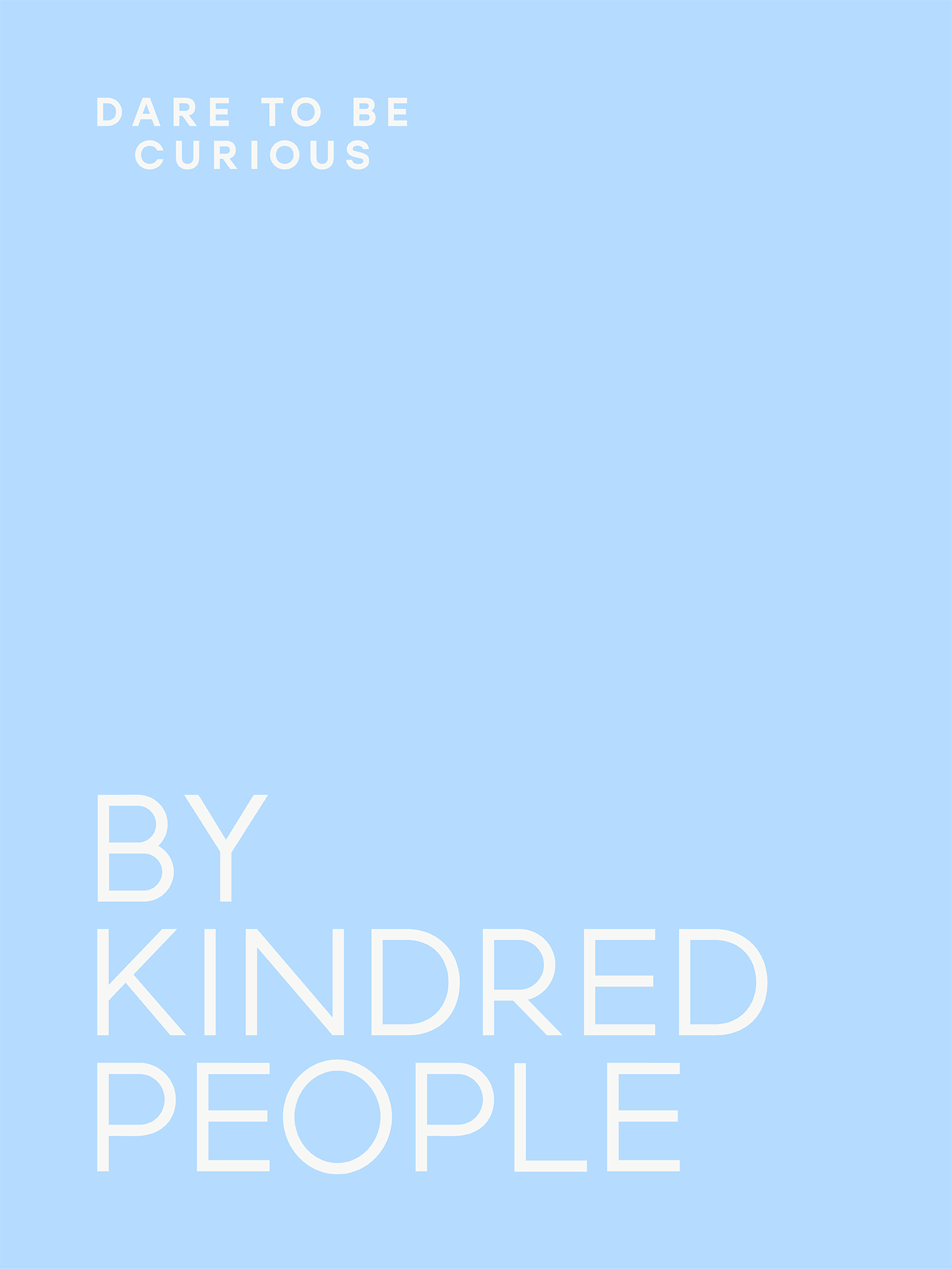
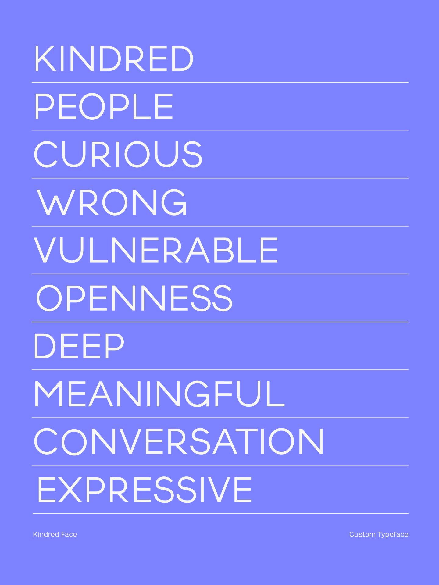
We created the bespoke, humanist typeface, Kindred Face from the custom lettering created for the logo. This sits comfortably alongside Maison – a sans serif, chosen for its character, approachability and high readability.
We kicked off Kindred People’s identity design through the Dare To Be Curious game and packaging. This is coffee table-worthy box set is small and transportable, ready for conversations anywhere. The series of fluid human forms we created expressed vulnerability and change, inspired by sensations of this conversational game.
The soft, comforting colour palette has heaps of shelf appeal and recognition — addressing one of Kindred People’s core goals. The colour palette is comprised of unexpected combinations of pastels and contradictory bolder tones. We developed varying colour combinations for distinct editions, including the German and English language versions.
We created the bespoke, humanist typeface, Kindred Face from the custom lettering created for the logo. This sits comfortably alongside Maison – a sans serif, chosen for its character, approachability and high readability.
CONCEPT
Georgia Grainger
PRODUCT PHOTOGRAPHY
Giovanni Dominice
PROJECT PHOTOGRAPHY
Emma Hursey
2021 – 2022
